Microsoft Excel এ Line চার্ট তৈরি করার নিয়ম
পূর্বের আলোচনায় আমরা কিভাবে Microsoft Excel এ কলাম চার্ট ও পাই চার্ট তৈরি করতে হয় তার একটি প্রাথমিক ধারণা দিয়েছি। চার্ট বা গ্রাফ তৈরির এ পর্যায়ে আমরা আলোচনা করবো Microsoft Excel এ Line চার্ট তৈরি করার নিয়ম সম্পর্কে। আসুন জেনে নেই কিভাবে Microsoft Excel এ Line চার্ট তৈরি করতে হয়।
আমরা দেখি যে ক্রিকেট খেলাতে দুটি দলের রানের তুলনামূলক একটি গ্রাফ যা লাইন প্রায়ই লাইন আকারে থাকে । যেমন দুই দলের রানরেট বা উইকেটের পতন এর চার্ট । আবার শেয়ার বাজারে বিভিন্ন কোম্পানির লভ্যাংশের অনুপাত দেখানোর ক্ষেত্রেও লাইন চার্ট ব্যবহার হতে দেখা যায়। এখন আমরা নিচে দুটি ক্রিকেট দলের উইকেট পতনের একটি টেবিল তৈরি করে দেখাবোঃ
ধরুন বাংলাদেশ ও ভারতের মধ্যে T20 ক্রিকেট ম্যাচ হচ্ছে এবং ধরে নেয়া যাক বাংলাদেশ ২০ ওভারে হারিয়েছে ৫টি উইকেট এবং ভারত ১৭ ওভারেই ১০ উইকেট হারিয়েছে । তো সেই ডাটা গুলো নিচে দেয়া হল ।
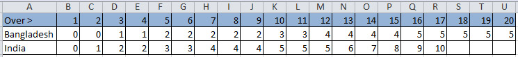
A table of Wickets Falling form Two Team in Excel
উপরের ছবিতে লক্ষ্য করুন, দুটি দলের উইকেট পতনের একটি টেবিল তৈরি করা হয়েছে। এখন আমরা উপরের টেবিল অনুযায়ী নিচে এক্সেল ওয়ার্কশীটে লাইন চার্ট তৈরি করার নিয়ম আলোচনা করবো এবং ছবির মাধ্যমে তা দেখাবো।
উপরের টেবিল অনুযায়ী দুটি দলের উইকেট পতনের একটি Line চার্ট তৈরি করা জন্য প্রথমে দুটি দলের উইকেটের রো দুটি সিলেক্ট করুন। এবার Insert ট্যাবে ক্লিক, তারপর Charts গ্রুপের Line চার্টে ক্লিক করুন। তাহলে লাইন চার্টের একটি লিস্ট আসবে, সেখান থেকে আপনার পছন্দ মতো চার্ট বাছাই করে তার উপরে ক্লিক করুন। তাহলে ওয়ার্কশীটে টেবিল অনুযায়ী উইকেট পতনের লাইন চার্টটি চলে আসবে।
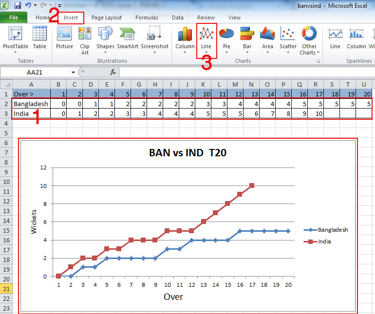
Use of Line Chart About Wickets Falling from Two Team in Excel
উপরের ছবিতে লক্ষ্য করুন, দুটি দলের উইকেট পতনের একটি লাইন চার্ট তৈরি করা হয়েছে। চার্টে লাল লাইনটি ইন্ডিয়া ও নীল লাইনটি বাংলাদেশের উইকেট পতন নির্দেশ করছে, এবং নিচের সংখ্যা গুলো ওভার ও বামের সংখ্যা গুলো উইকেট নির্দেশ করছে।
আজকের আলোচনায় আমরা আপনাদেরকে Microsoft Excel এ Line চার্ট তৈরি করার নিয়ম সম্পর্কে প্রাথমিক ধারণা দেয়ার চেষ্টা করেছি। আগামীতে আমরা আলোচনা করবো চার্টে কিভাবে Axis Titles, Chart Titles ও Design অপশন গুলো ব্যবহার করতে হয়। সে পর্যন্ত আমাদের সাথেই থাকুন, ধন্যবাদ …
পরবর্তী টিউটোরিয়ালঃ Microsoft Excel এ চার্টে Axis Titles এবং Chart Title এর ব্যবহার
আগের টিউটোরিয়ালঃ Microsoft Excel এ Pie চার্ট তৈরি করার নিয়ম